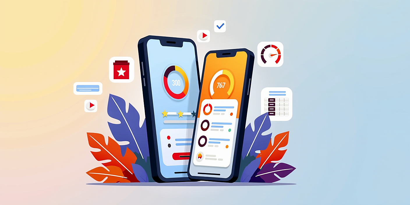
Color selection for mobile apps: Useful tips and psychology
The color selection process for a mobile app is important. Colors influence users' emotions. Choose the right colors and achieve success!
Introduction
The color selection process is crucial for mobile app developers and designers. Colors not only ensure an aesthetic appearance, but also influence users' emotions and behaviors.
Selecting the right colors is one of the factors that determine the success of a mobile application. This article outlines important aspects and practical tips related to the color selection process.
Color Psychology
Colors convey their own meaning and emotional responses. Each color evokes specific feelings in users:
- Red: energy, urgency, speed
- Blue: trust, calmness, professionalism
- Green: nature, freshness, health
These colors can influence the user's interaction with the app. For example, financial apps often use blue because it conveys reliability.
Creatng a Color Palette
The process of creating a color palette is very important in the initial stages. There are several steps to accomplish this:
- Select a primary color: choose a color that aligns with your app's main goals.
- Select secondary colors: add colors that complement the primary color.
- Pay attention to contrast: ensure there is good contrast between text and background colors.
It is also important to consider users' color vision capabilities when creating a color palette. For example, it is recommended to select appropriate colors for users with limited color vision.
Testing Colors
After selecting the colors, testing them is very important. There are several methods available to gather user opinions:
- UX tests: allow users to test the app and get their feedback on the colors.
- Surveys: invite users to participate in a survey with questions about the colors.
Through these methods, it is possible to determine the impact of colors and adapt them to user preferences.
FAQ
What mistakes should be avoided when selecting colors?
The most common errors include not choosing proper contrast between colors and not considering users' color vision capabilities.
How can you make colors match each other?
To create harmony among colors, it is necessary to use the theory of colors by taking into account primary and secondary hues.
How can you test colors?
It is recommended to gather user feedback through UX tests and surveys when testing colors.
What should the best color palette for mobile apps be like?
The best color palette should match the app's purpose, be user-friendly and suitable for visual perception.
Conclusion
The process of choosing colors for a mobile application is complex but important. Colors not only affect aesthetics, but also influence users' emotions.
Selecting the right colors can increase your app's success. Knowing about color psychology, creating and testing palettes will provide you with necessary knowledge.