Responsive Design: Ways to Achieve Success in Website Creation
Adapt your website to various devices and provide a convenient experience for users with responsive design. Successfully launch your own website.
Introduction
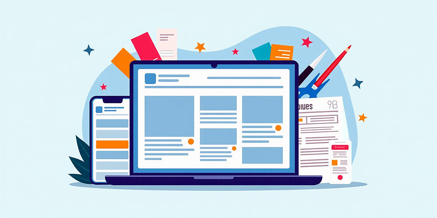
Responsive design helps create websites that are suitable for mobile devices and various screen sizes. It provides a convenient experience for users and increases the success of the site.
In this article, we will talk about the main principles, methods, and best practices of responsive design. We aim to provide you with necessary knowledge.
Basic Principles of Responsive Design
There are several basic principles of responsive design. They are essential for presenting a website comfortably on various devices:
- Fluid grid layouts: The sizes of elements are defined in percentages, which ensures that they adapt to the screen size.
- Media queries: This allows applying different styles based on screen size using CSS.
- Flexible images: Image sizes are also flexible and change according to screen size.
The Process of Creating Responsive Design
We consider several important steps in creating responsive design:
- Understanding user experience: It is essential to identify users' needs and how they use devices.
- Creatng a prototype: Preparing an initial scheme of the website, getting opinions by testing with users.
- Testing and optimization: Checking the website on various devices and resolving problems is necessary.
Best Practices in Responsive Design
To achieve success in responsive design, it is recommended to follow these practices:
- Avoiding pixel-based styles: Sizes should be defined as percentages or EM units.
- Minimalism: It's important not to use too many elements on the page and avoid confusing users' attention.
- Faster loading of pages: Optimizing images and other media files reduces load time.
FAQ
What is responsive design?
Responsive design refers to the ability of a website to adapt to different screen sizes. It provides users with convenient experience on any device.
What are media queries?
Media queries are CSS rules that allow applying various styles based on screen size or other properties.
How do fluid grid layouts work?
Fluid grid layouts work by defining the sizes of elements in percentages, which ensures their adaptability to page dimensions.
What are the advantages of responsive design?
Responsive design provides convenience for users, faster loading pages and good opportunities for SEO.
How can you test responsive design?
You can test responsive design on various devices and browsers, as well as by using special tools.
Conclusion
Responsive design is an essential part of modern websites. With these principles and practices, you can create your website more efficiently and user-friendly.
We wish you success in applying these recommendations to your work.